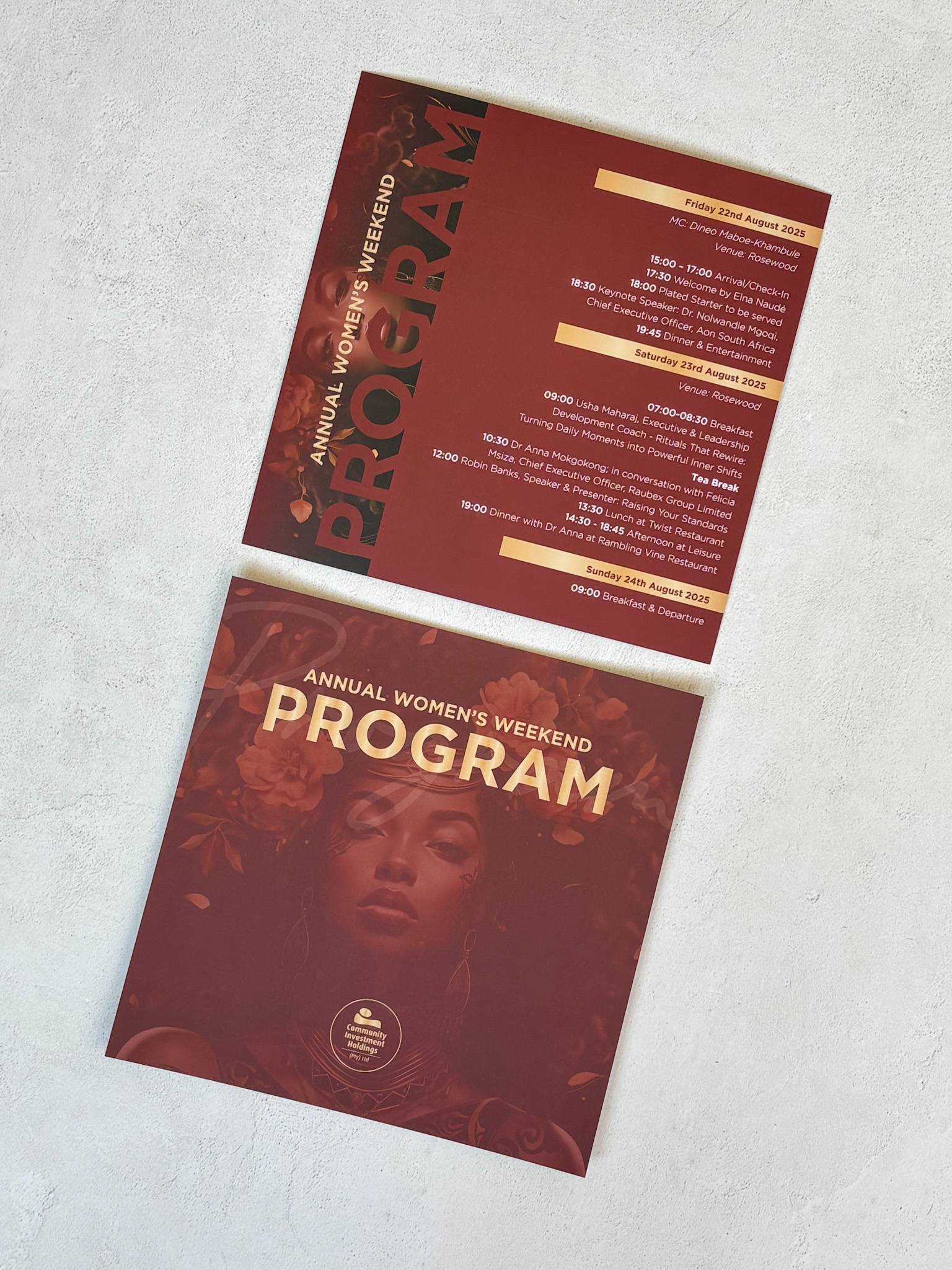
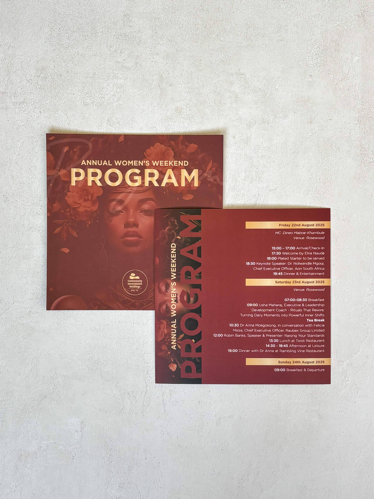
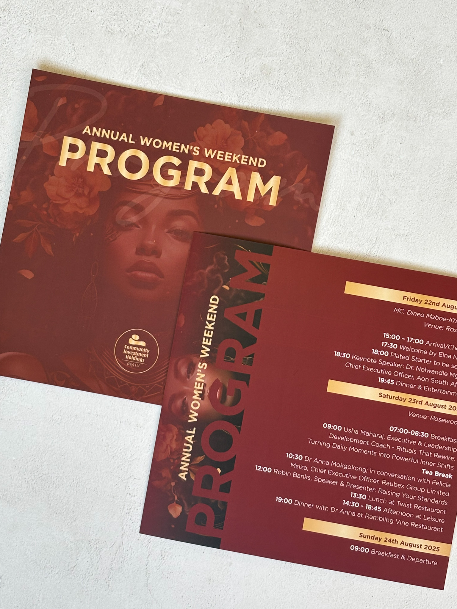
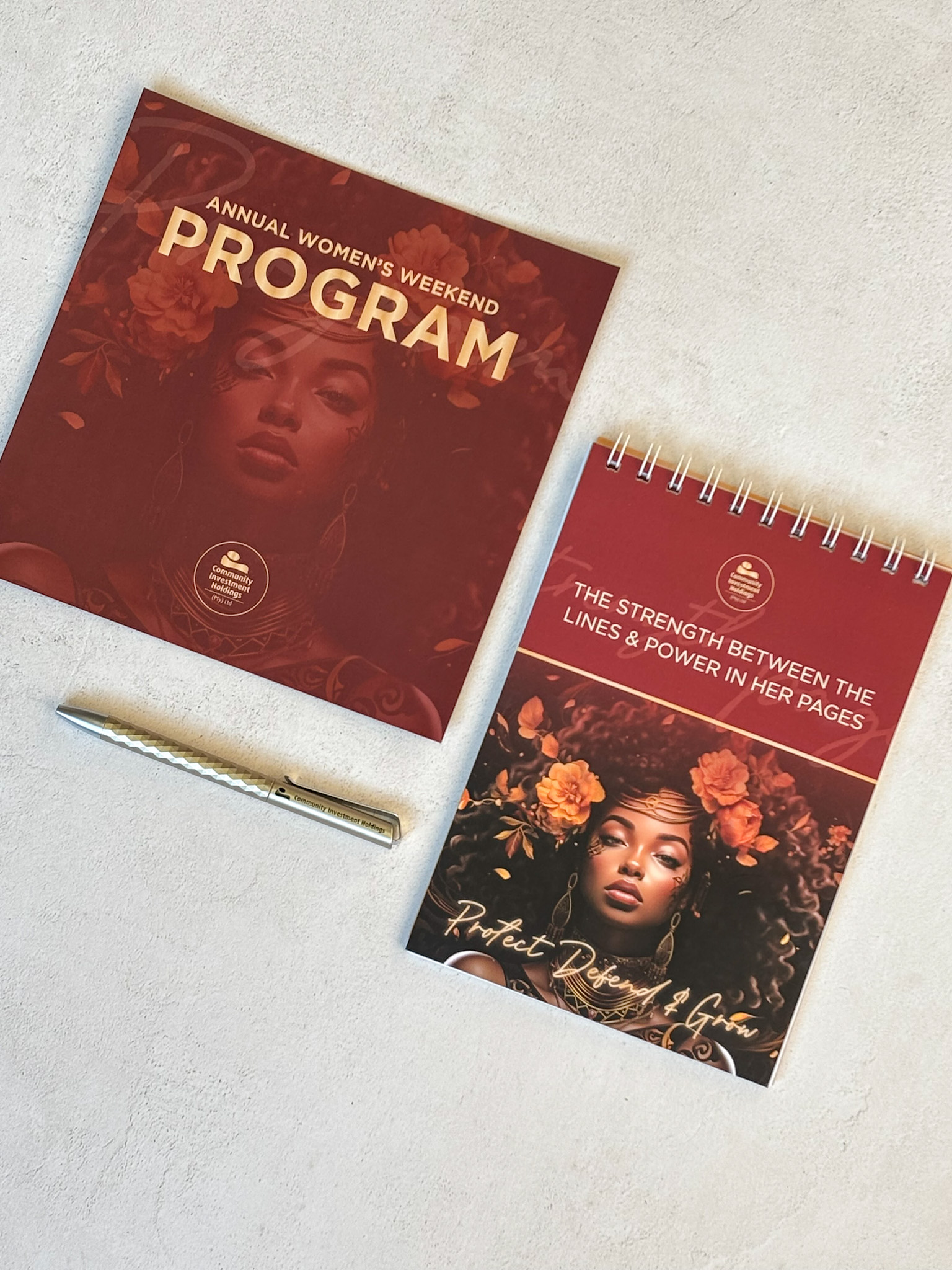
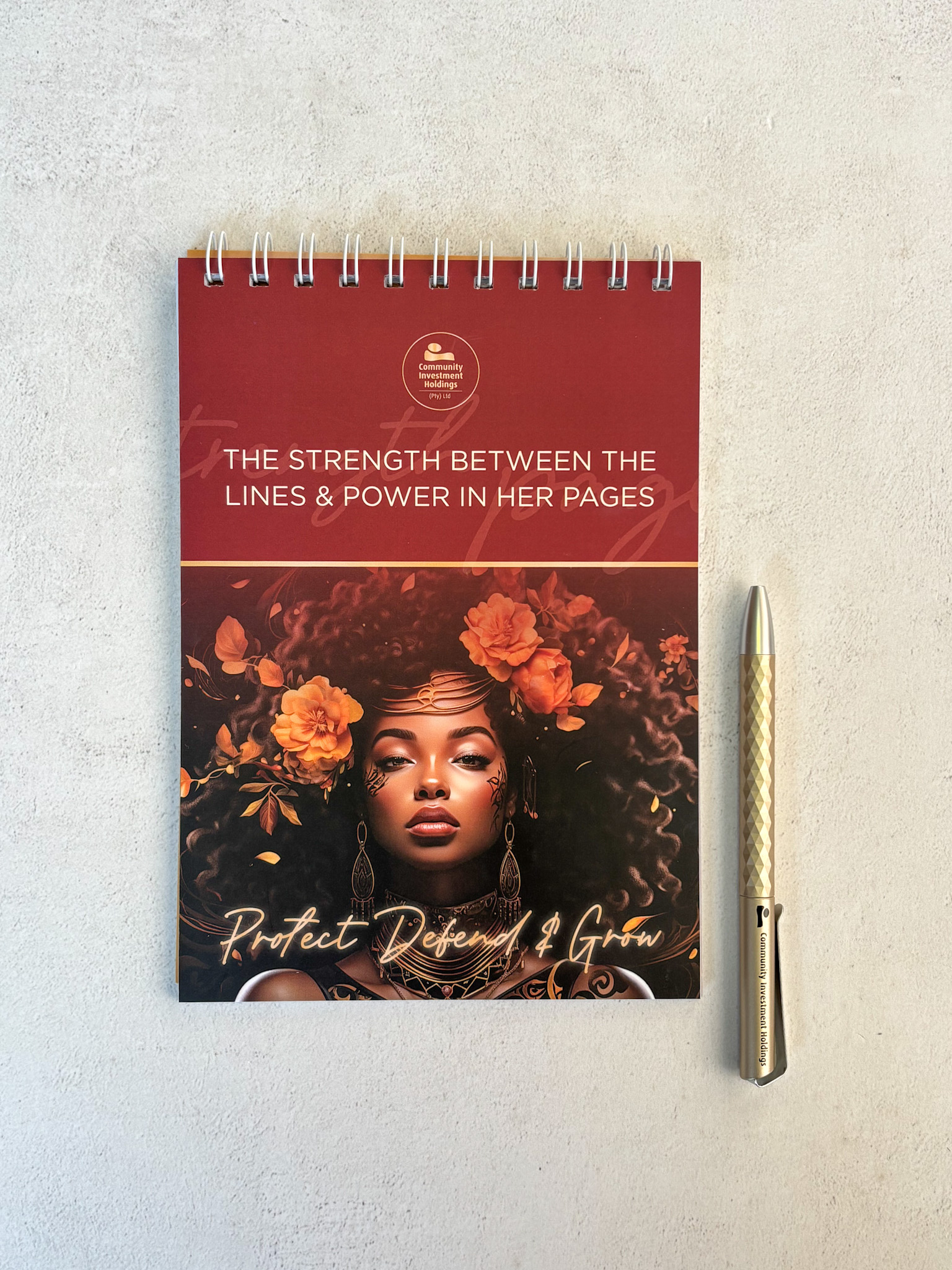
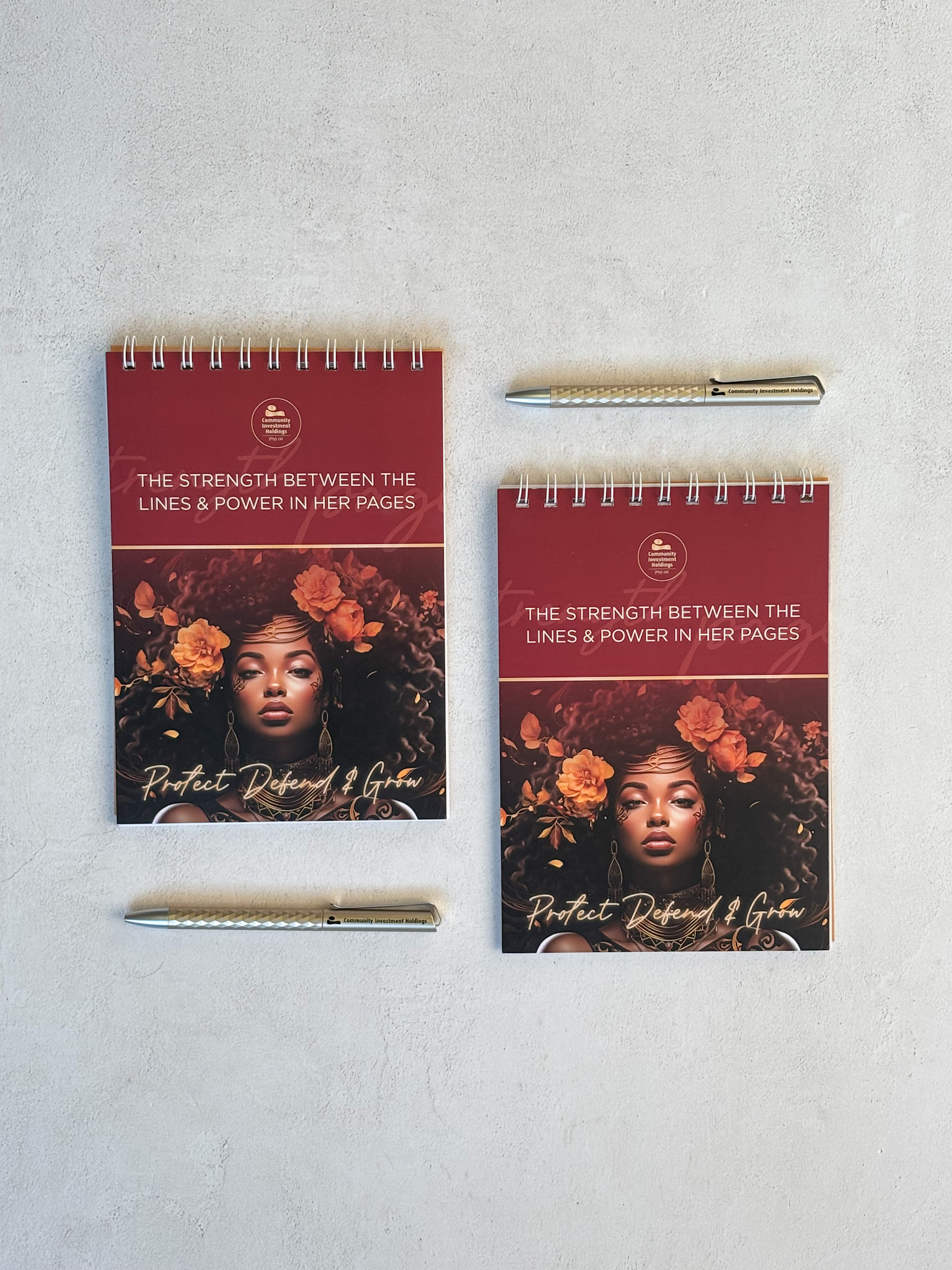
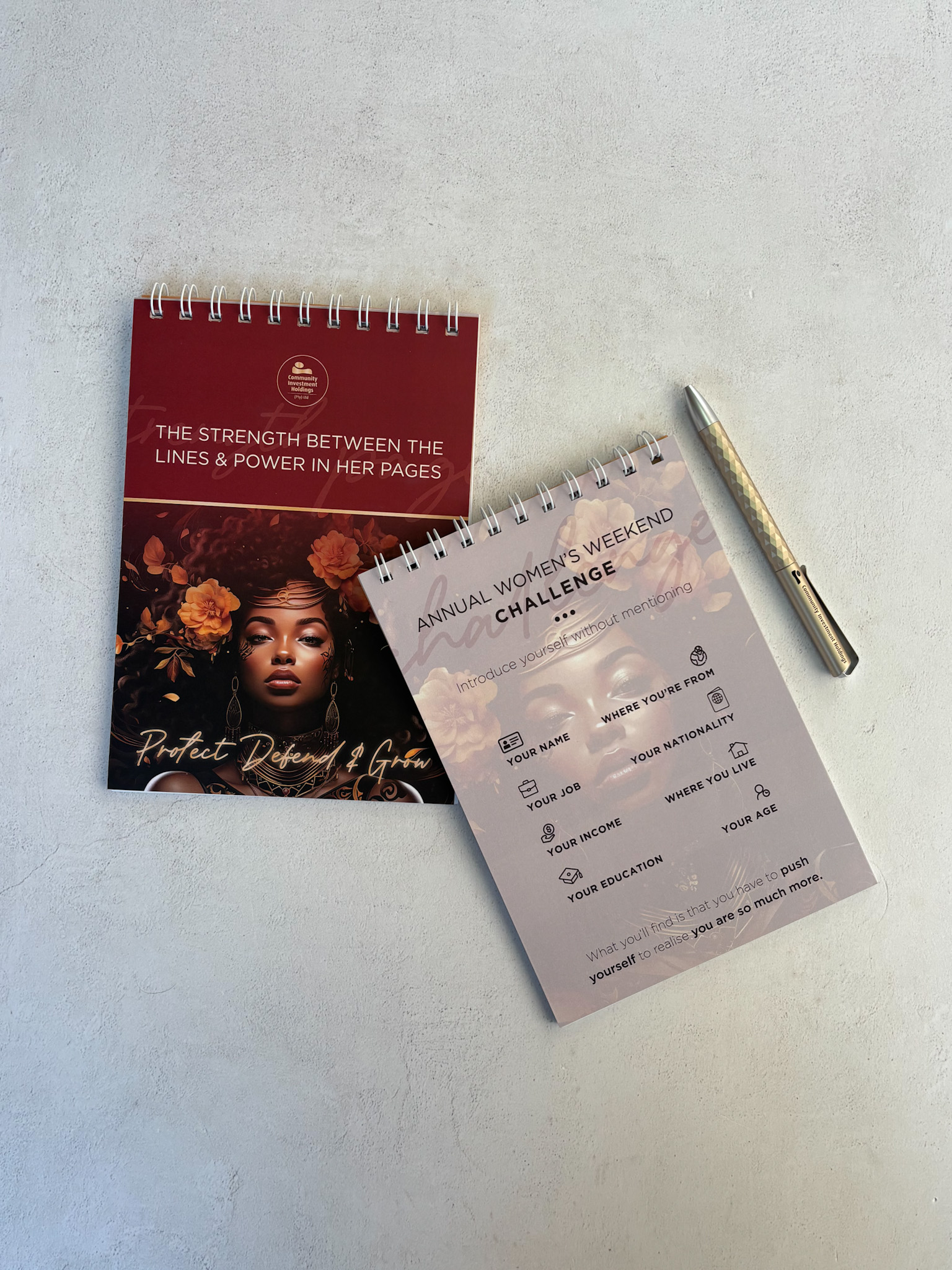
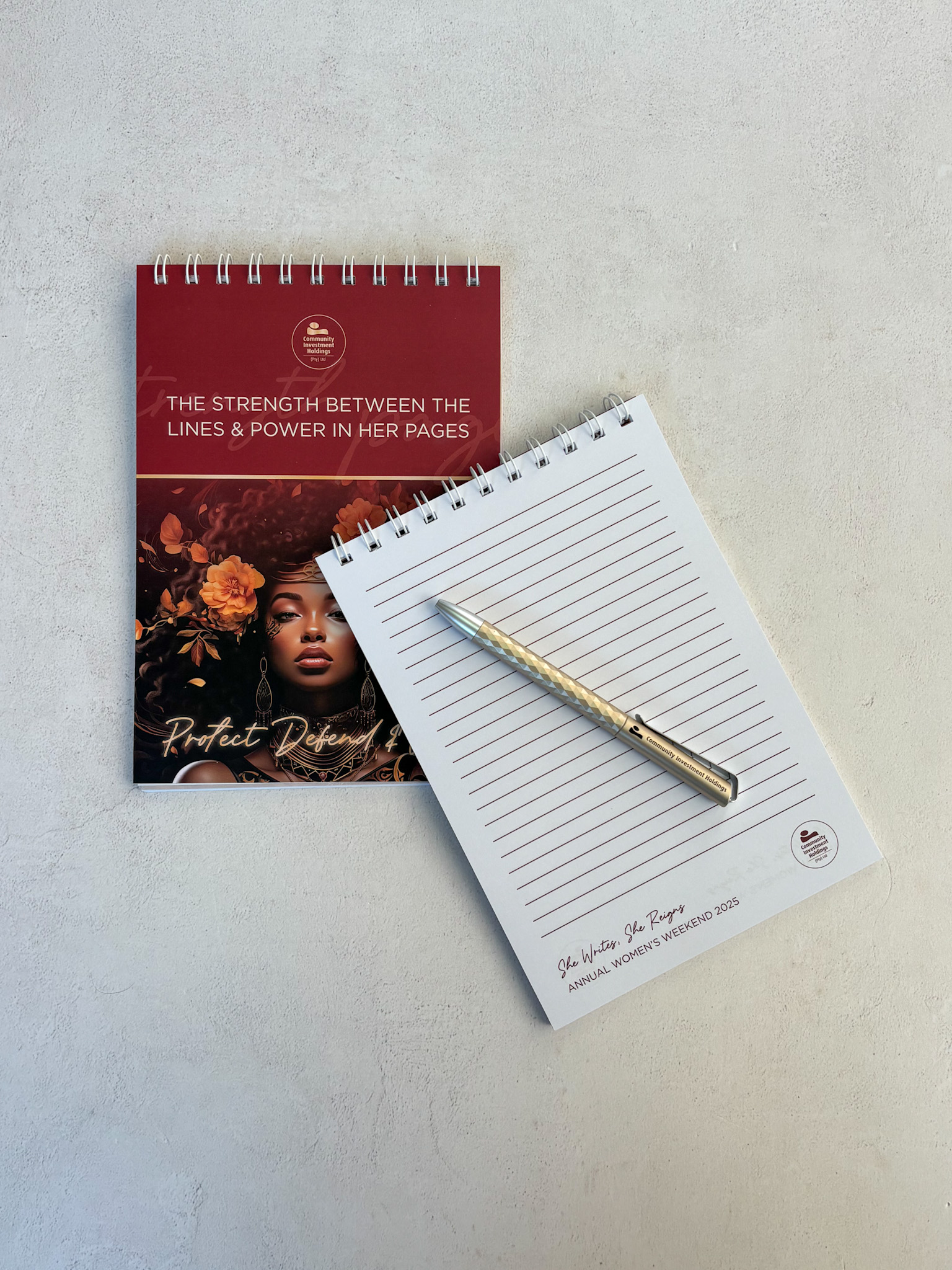
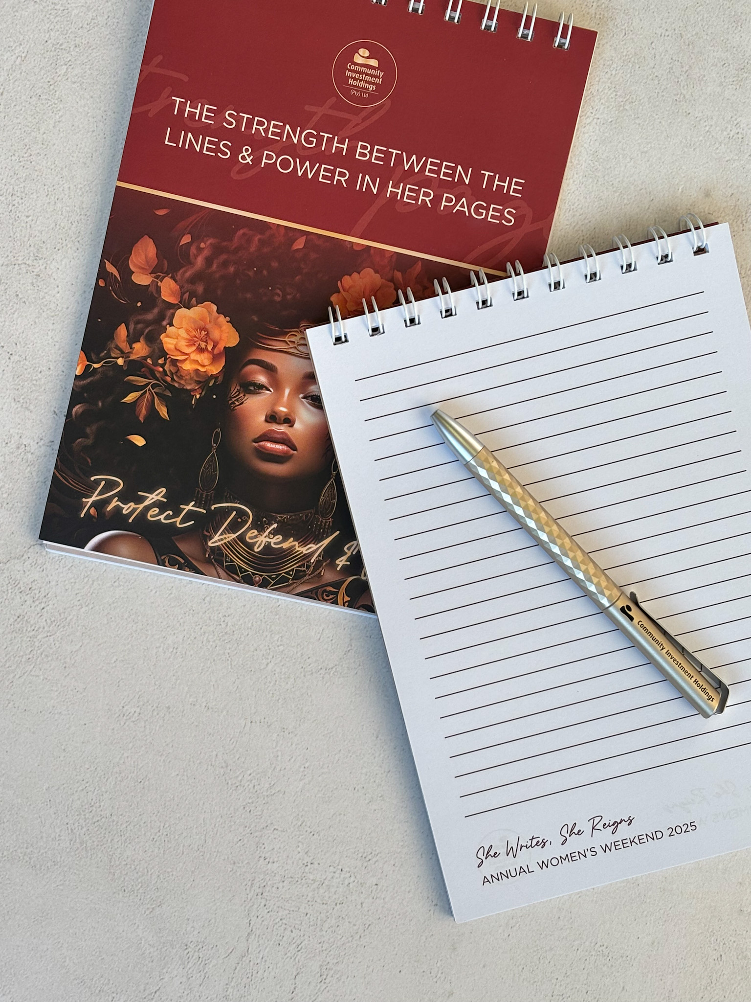
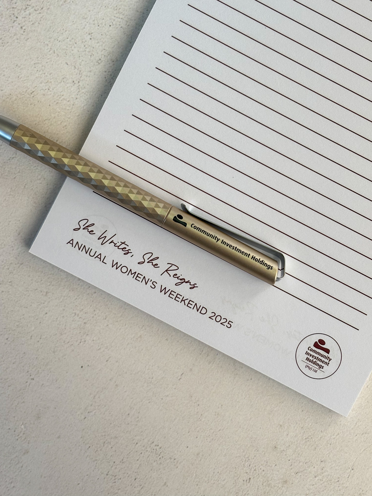
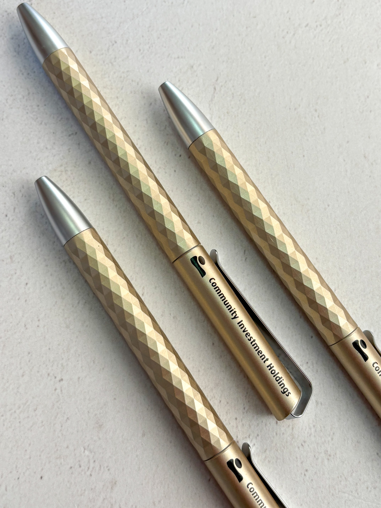
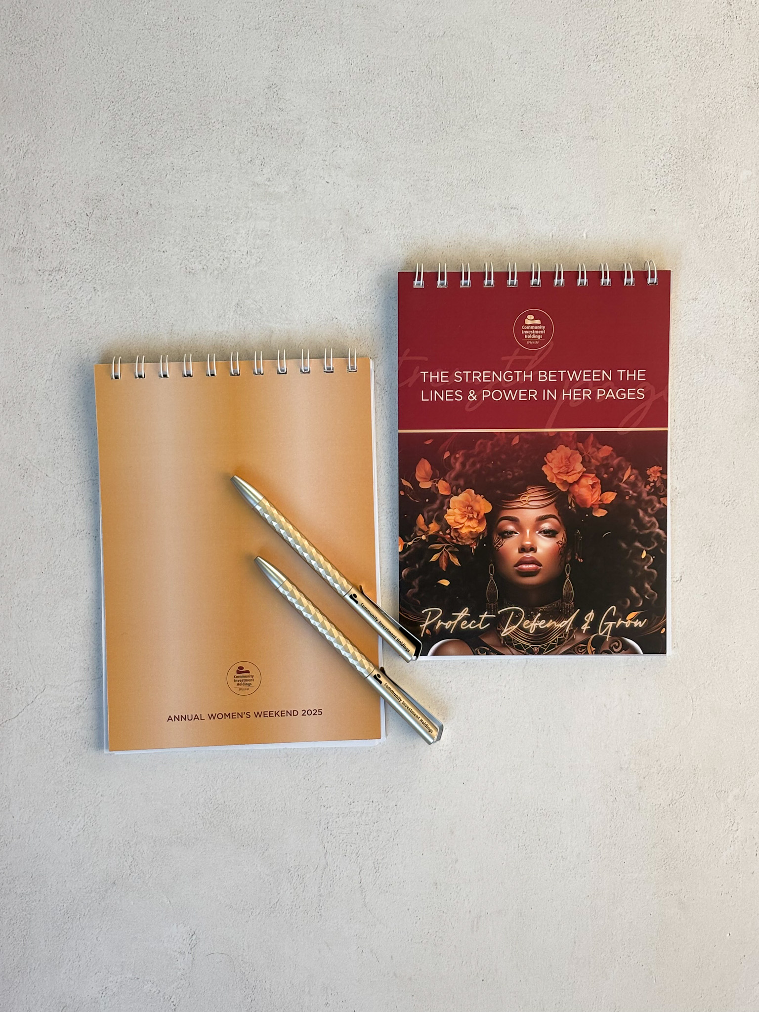
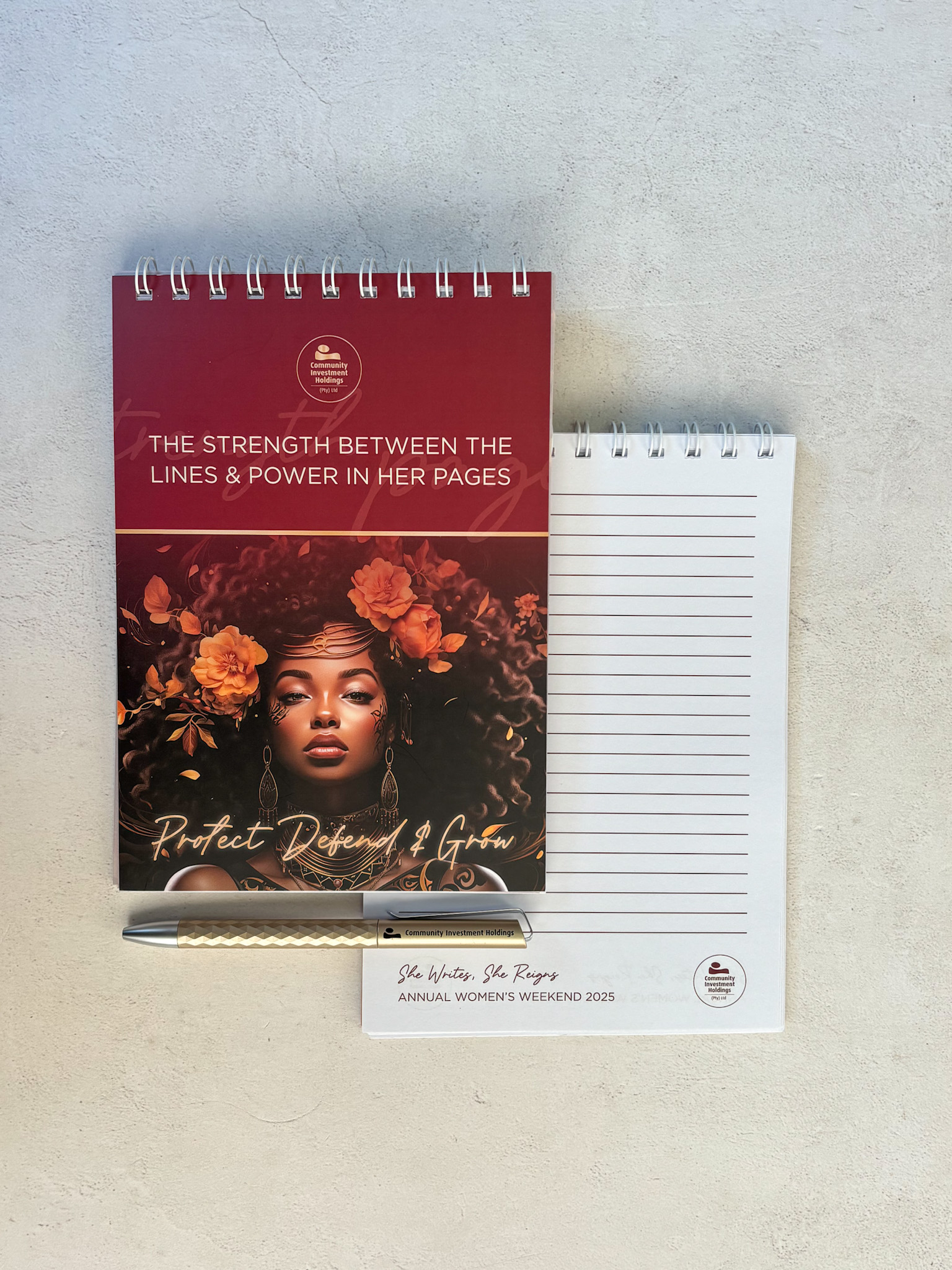
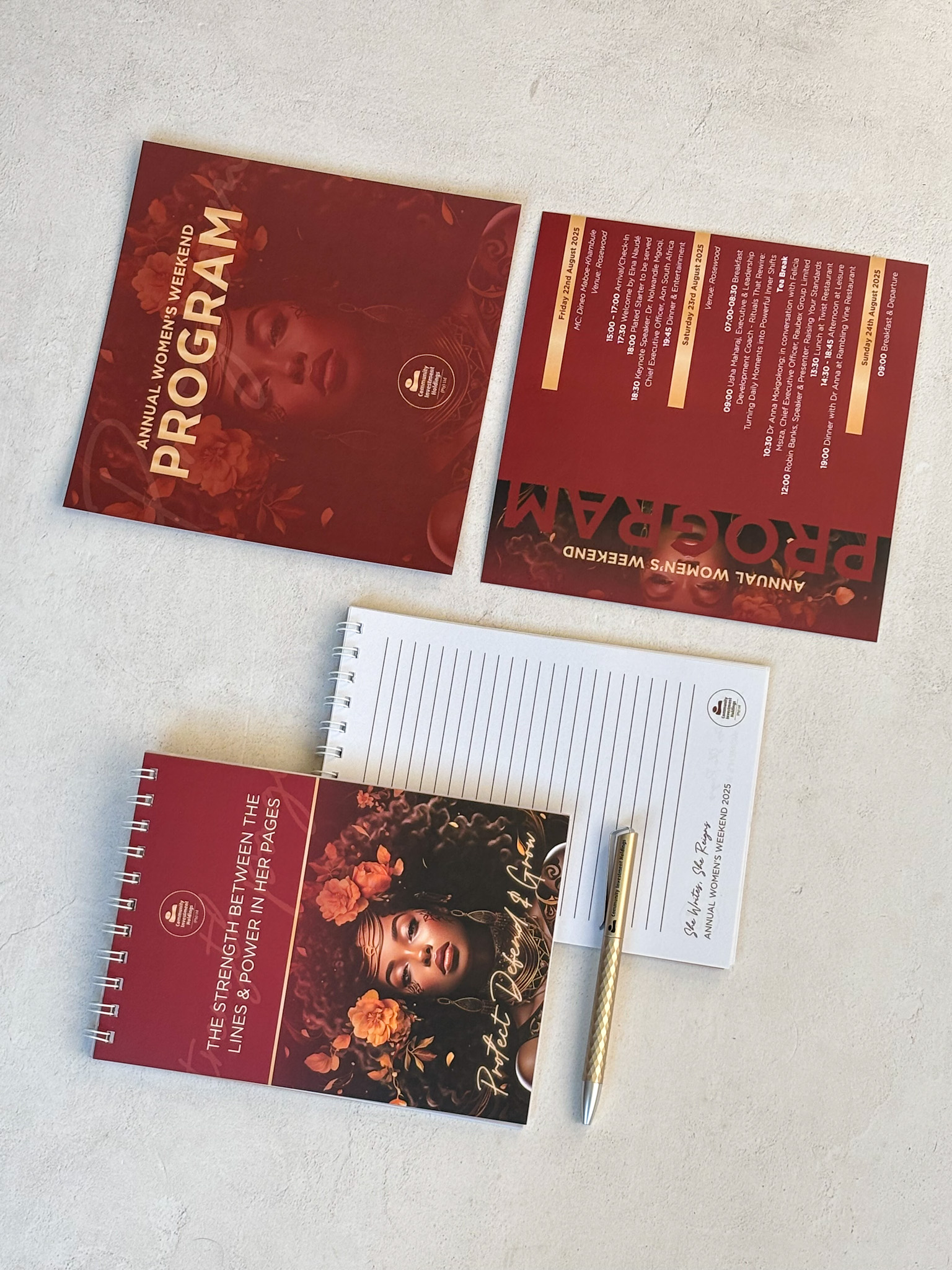
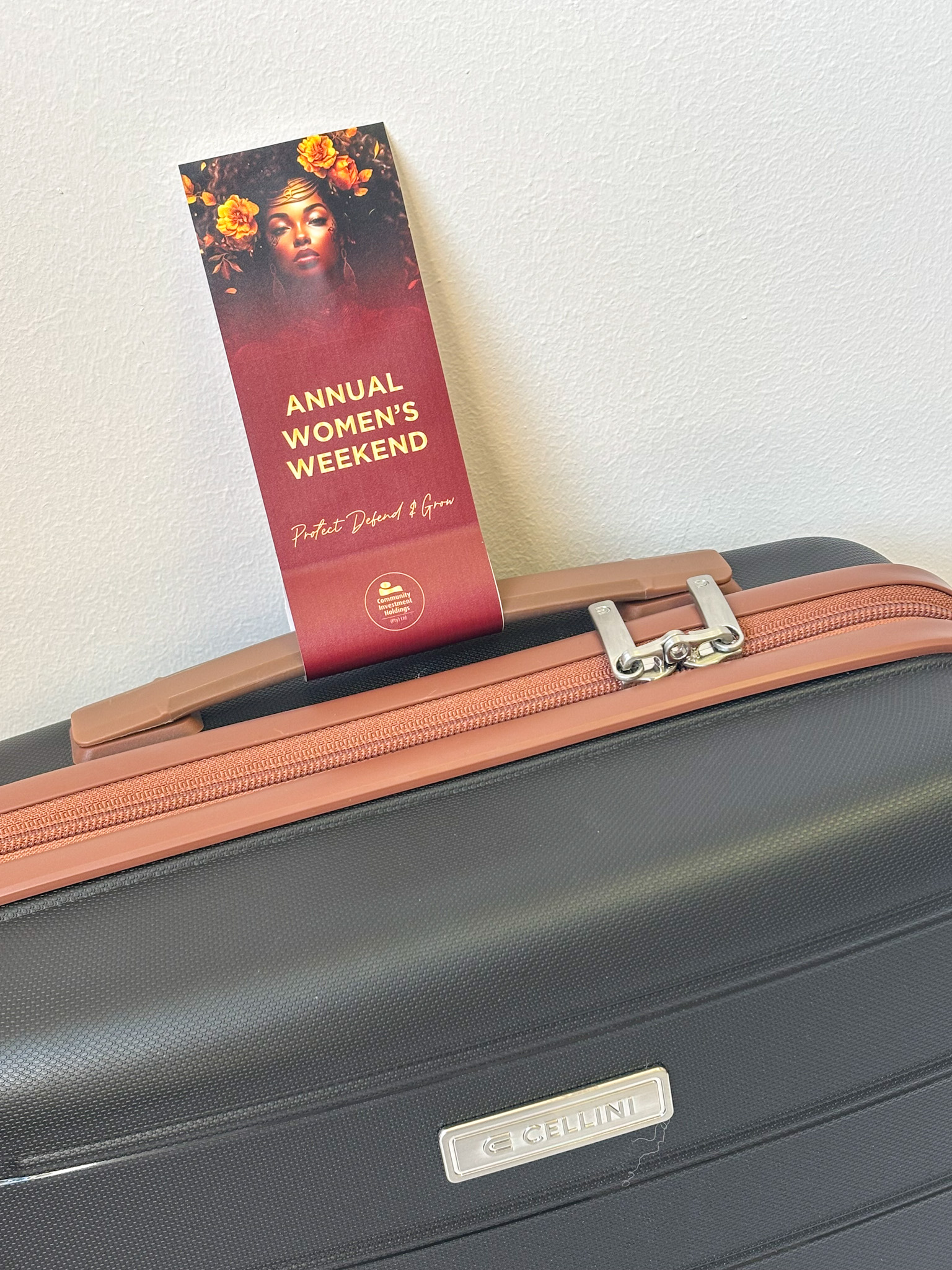
The client needed a cohesive identity and collection of branded touch points for a Women’s Weekend celebrating connection, confidence and the many forms of female strength. Every detail needed to feel elevated, thoughtful and worthy of the occasion.
The
Spark.
Shades of Strength.
Strength does not have a single look. The concept celebrated its many expressions through rich colour, layered florals and meaningful details—creating a feminine experience that felt powerful rather than predictable.
Before the speeches, sparkling wine and questionable dance moves, there’s the invitation—and it had better set the tone.
Made
Tangible.
The Look
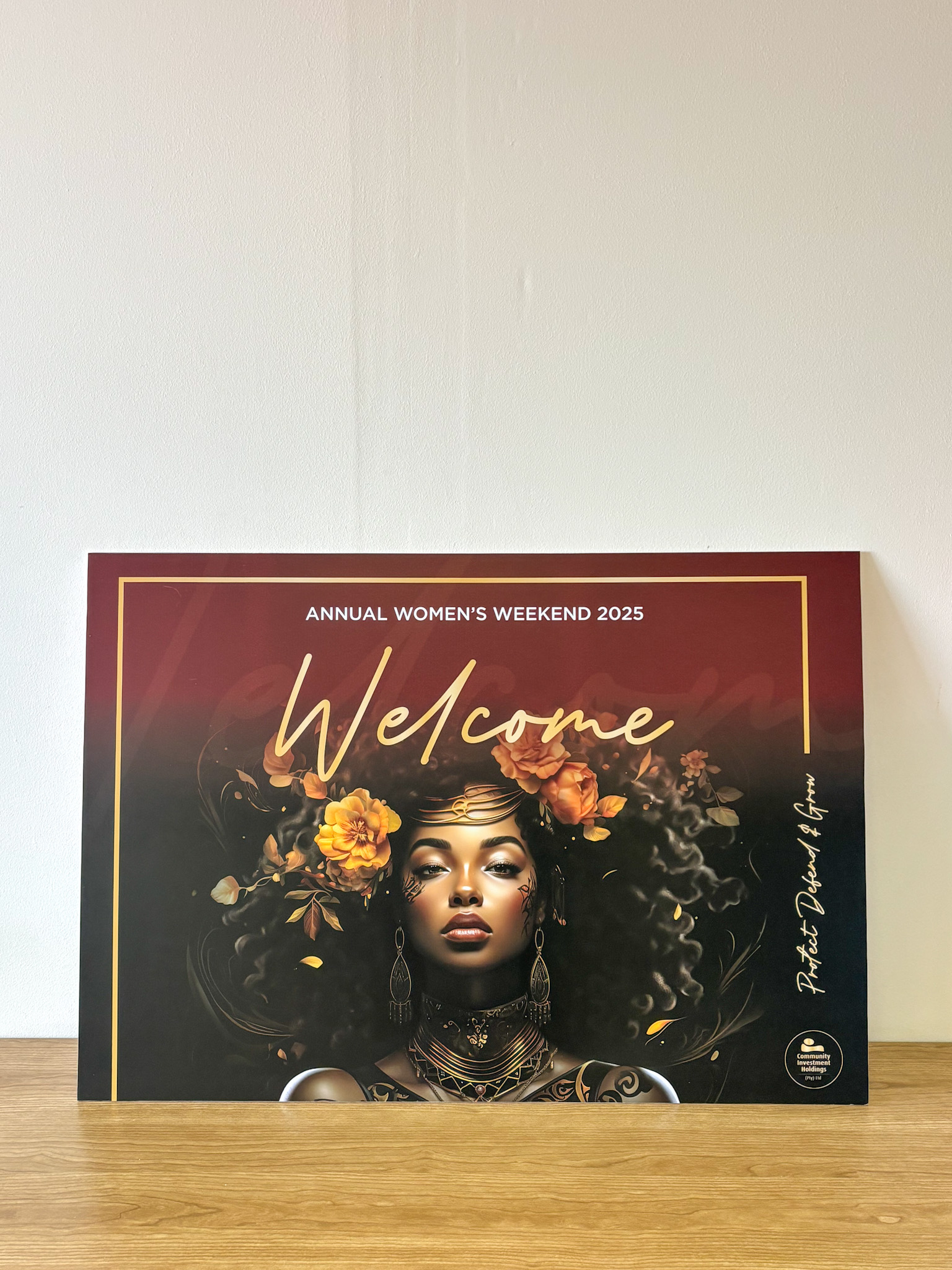
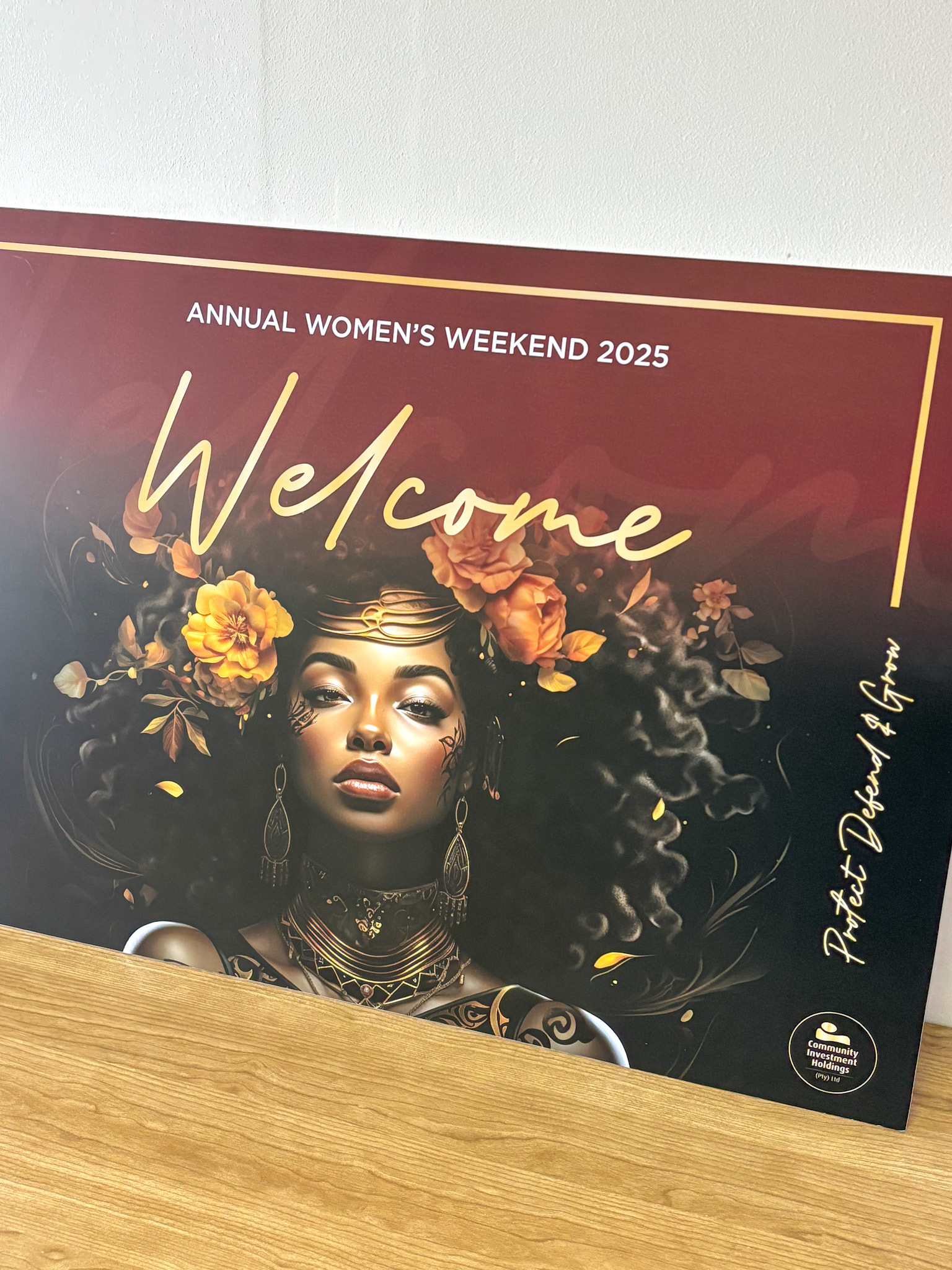
Deep plum, pink and berry tones were layered with expressive florals, elegant typography and touches of gold for a rich, sophisticated finish.
The Packaging
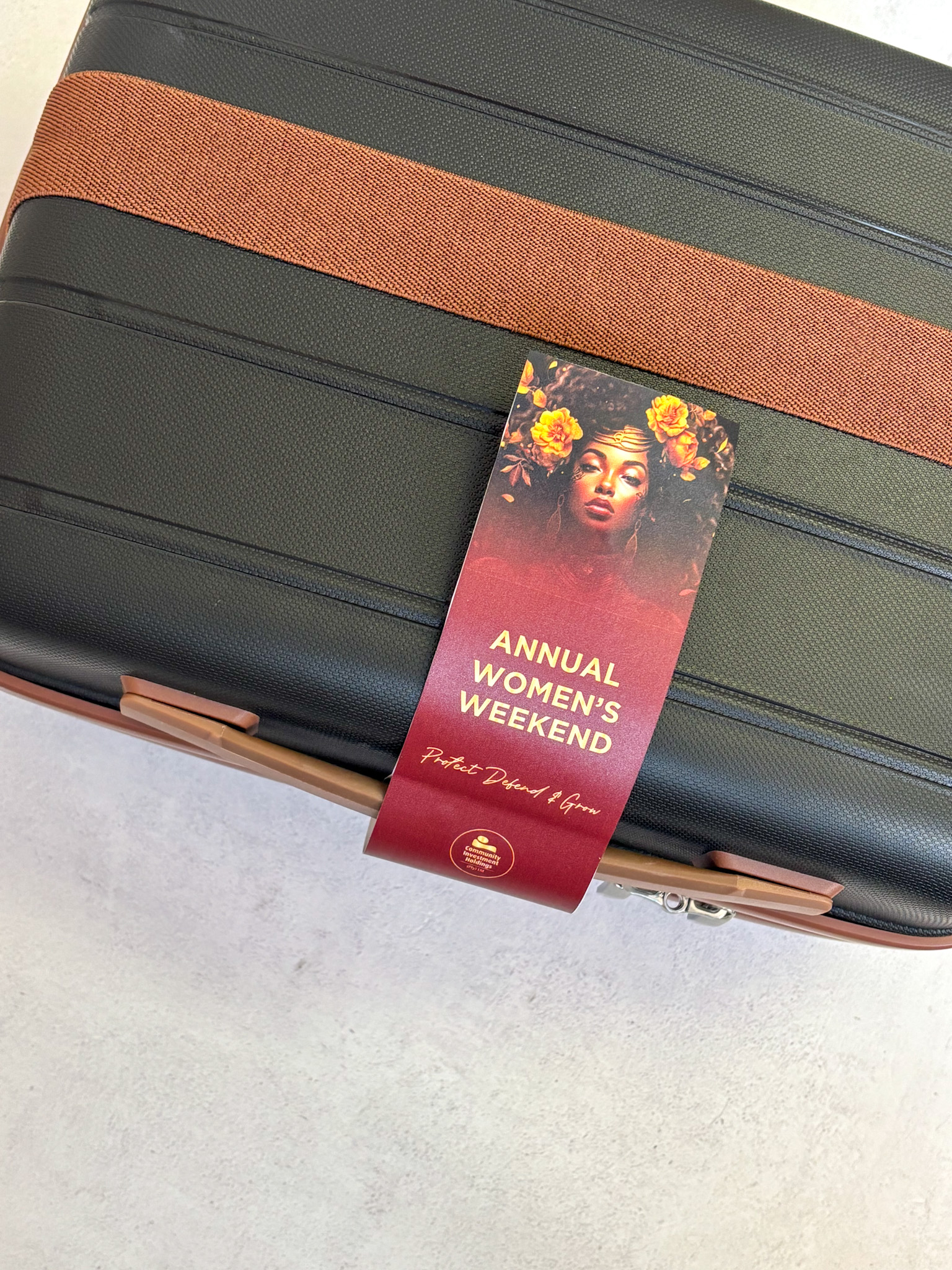
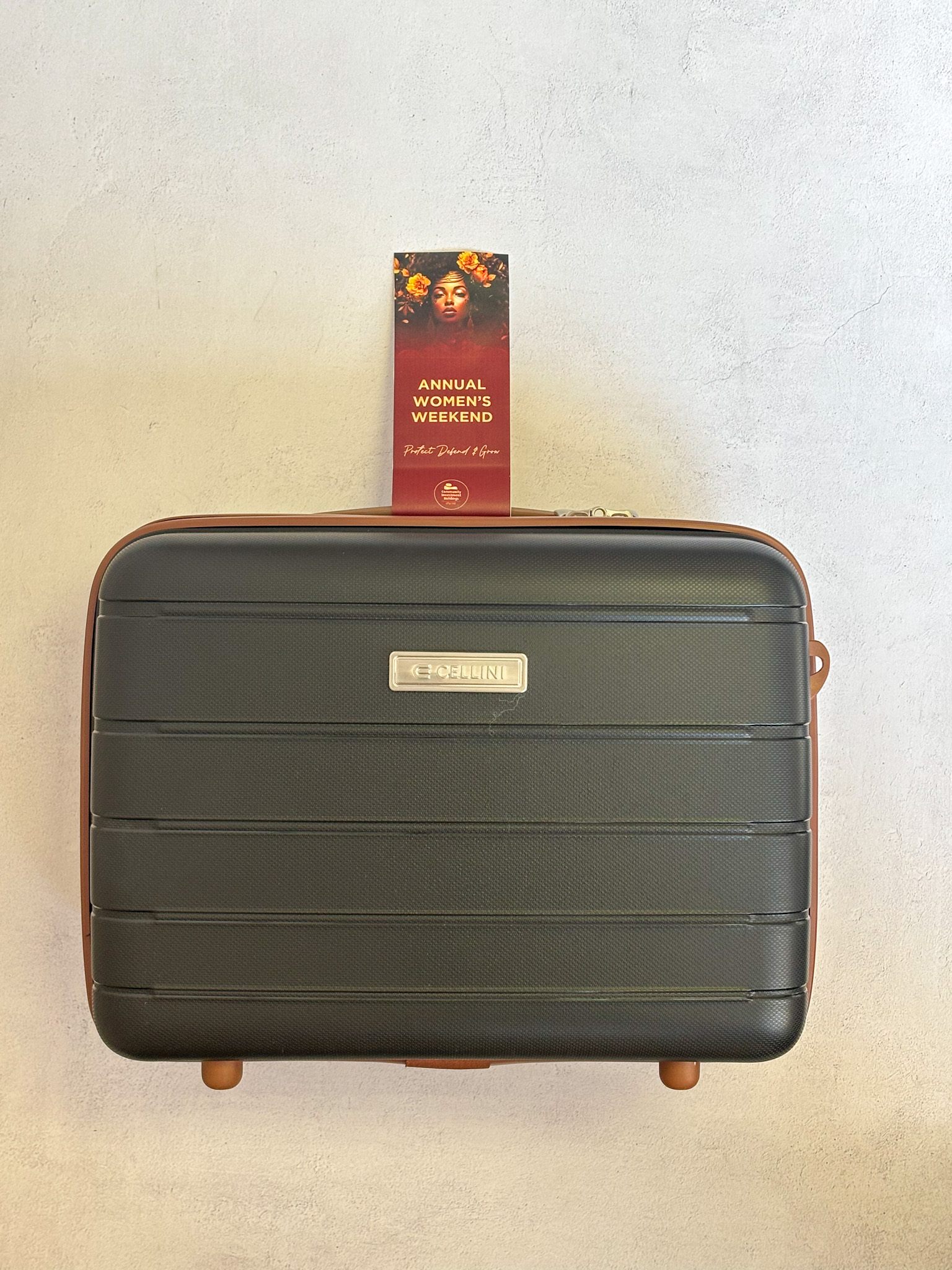
Custom sleeves, swing tags and printed stationery brought the identity across Fieldbar coolers, reusable Typo bags and curated gift collections.
The Message
Every element reinforced a celebration of women—their individuality, resilience, friendships and shared strength.
The Experience
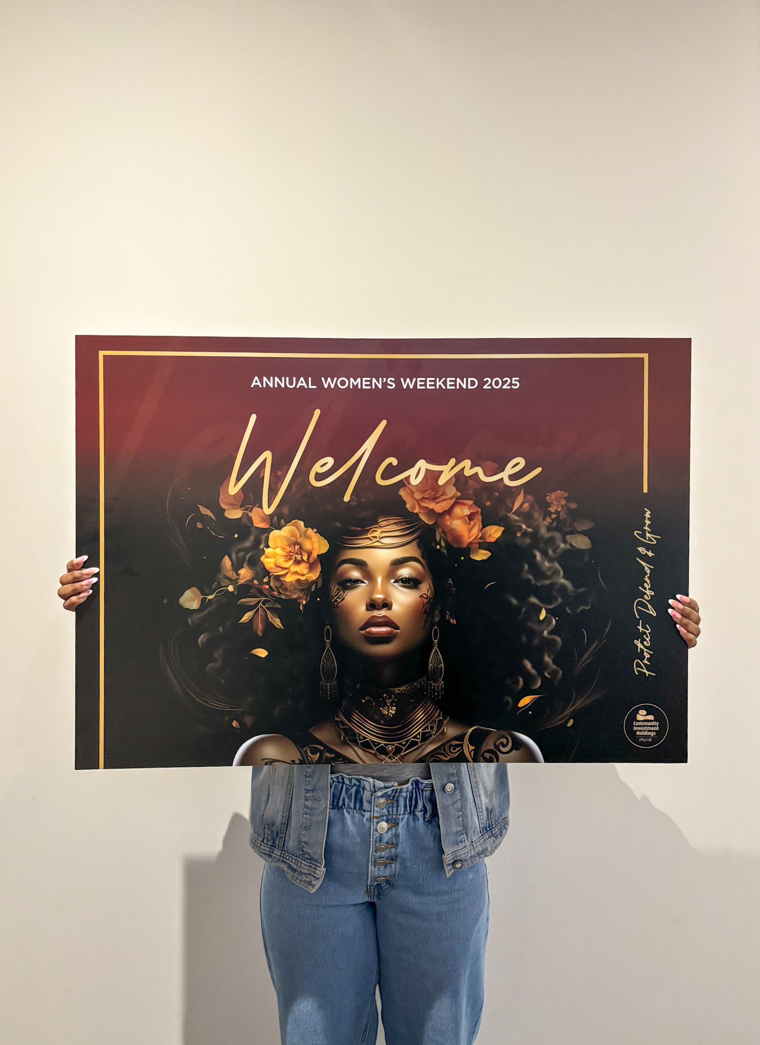
Guests encountered the concept throughout the weekend, from welcome signage and programmes to practical gifts, wine experiences and beautifully styled event details.
View the
full project.
The
Rebelle Touch.
The gifting was designed as part of the event rather than an add-on, with useful pieces, locally considered treats and event-specific packaging working together as one complete story.
Many shades. One unforgettable celebration of strength.
The gifting was designed as part of the event rather than an add-on, with useful pieces, locally considered treats and event-specific packaging working together as one complete story.
Many shades. One unforgettable celebration of strength.